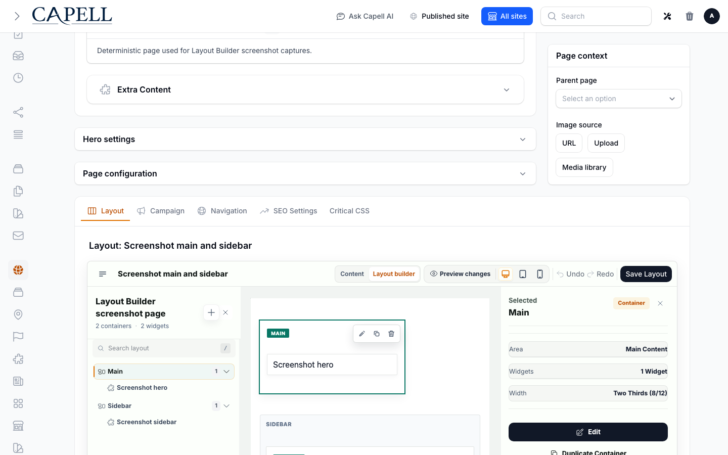
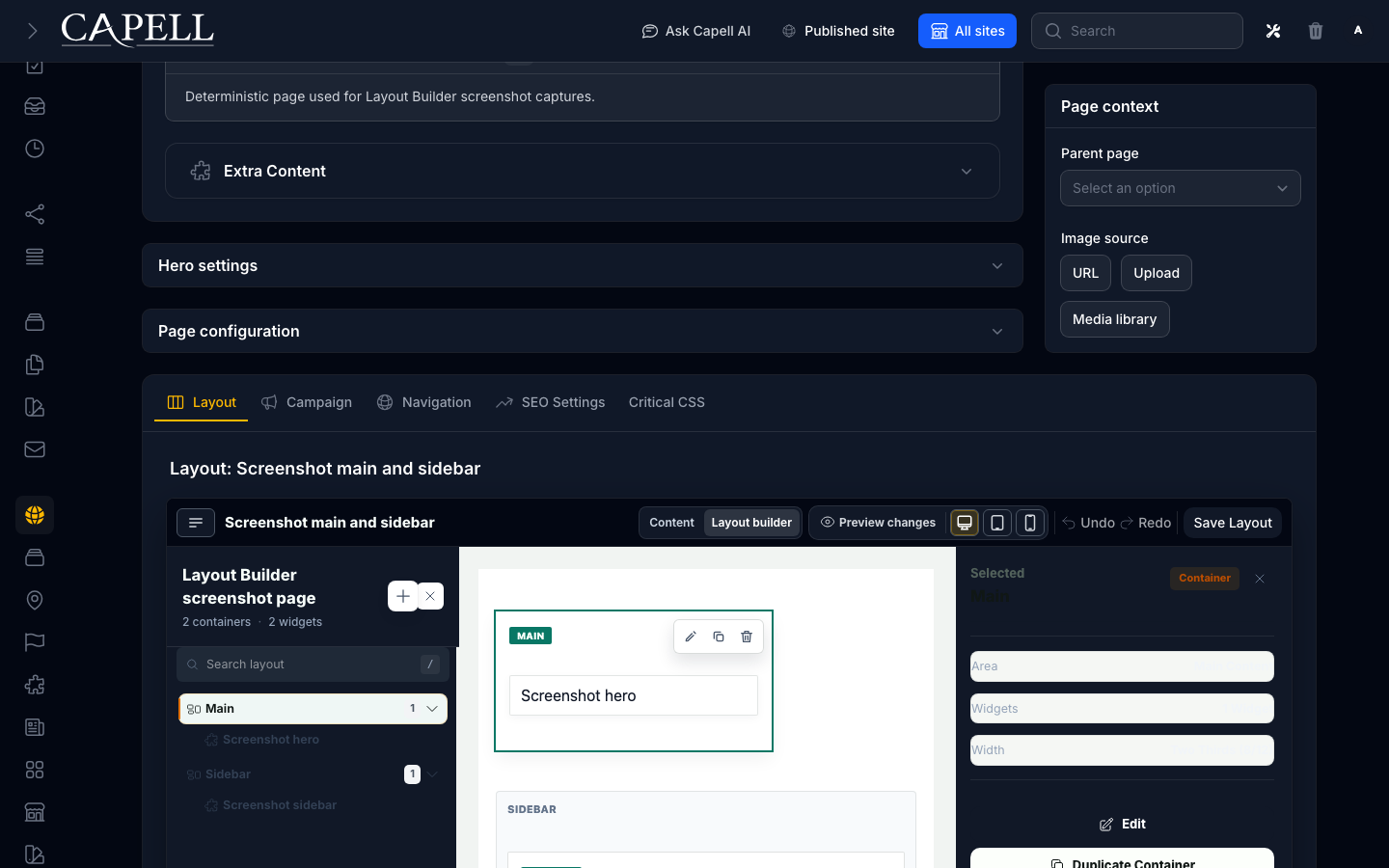
Open the page editor and select the container that holds the widgets you want to adjust.
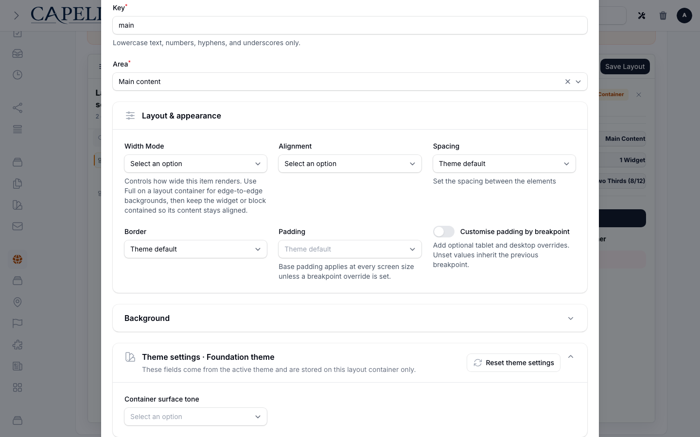
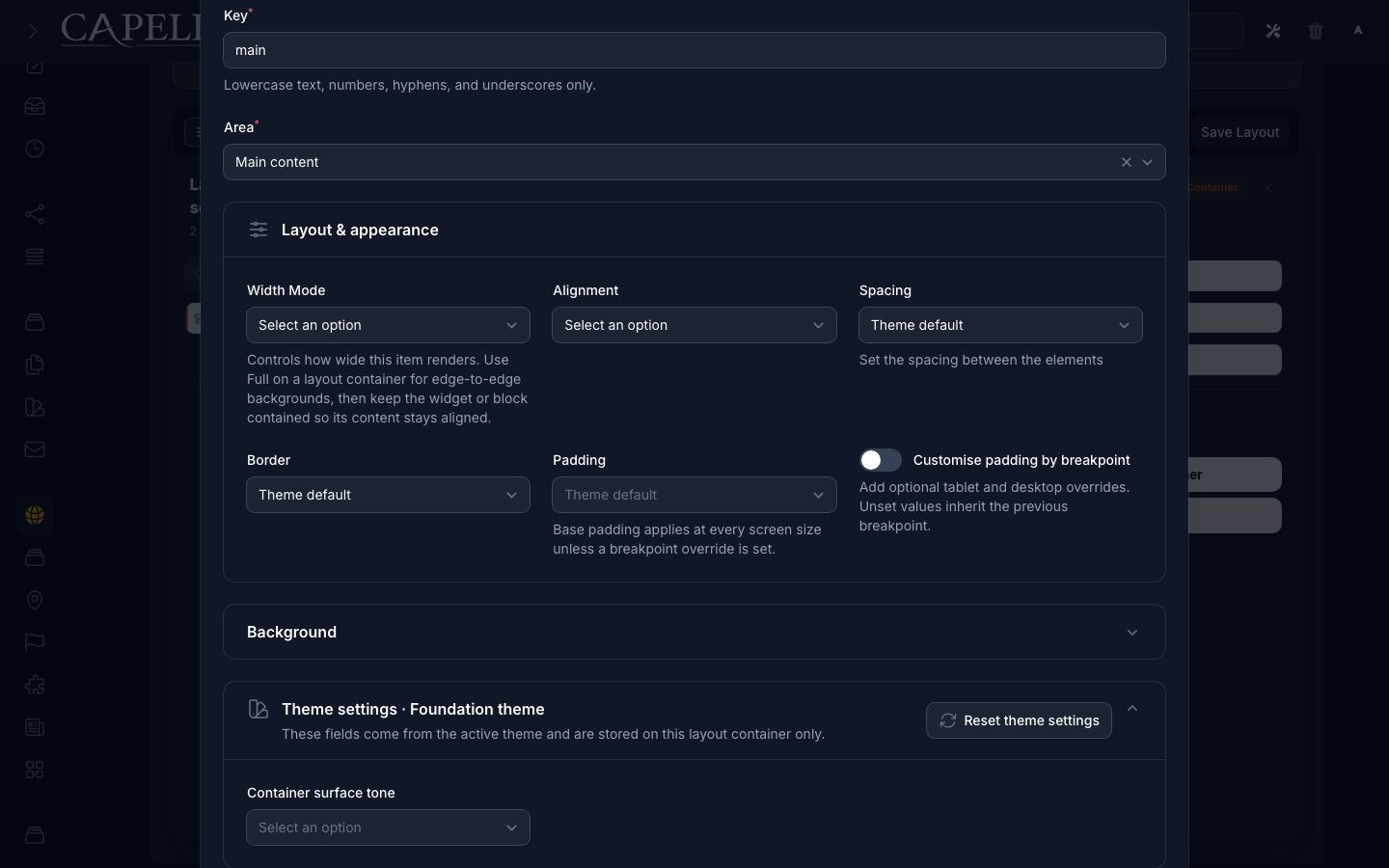
Open Layout & appearance. Set width and alignment, then use:
Spacing for the gap between widgets inside the container.
Padding for space between the container edge and its widgets.
Border for the container edge treatment.
Leave a value at Theme default to inherit the theme’s normal treatment. Choose None when the container must explicitly have no spacing, padding, or border, even if the theme supplies one.
To vary padding by screen size, enable Customise by breakpoint. Base padding applies at every size, tablet replaces it from the tablet breakpoint, and desktop replaces the effective tablet or base value from the desktop breakpoint. An empty override inherits the preceding value; None removes padding at that breakpoint.
Open Background only when the container needs its own background.
Open Theme settings · {Theme name} for controls supplied by the active theme. The swatch icon and description identify these as theme-owned values for this container only.
Use Reset theme settings to clear only this container’s values for the active theme. Confirm the action, then save the container normally. Core settings and values saved for other themes are left in place.
Open Advanced for column position, responsive visibility, tag, HTML class, column overrides, and legacy margin. Margin is outside the container; keep it for existing layouts, but prefer spacing and padding for new visual changes.
Pages with a few core widgets. Start with text, image, and button widgets so editors get comfortable building and arranging pages before you introduce more advanced blocks.